
Task
The goal was to update the existing typographic logo without changing its core appearance,
to develop an additional badge-style icon that visually reflects the essence of the brand.
The client wanted to preserve the current wordmark while complementing it with a distinctive symbol.
Solution
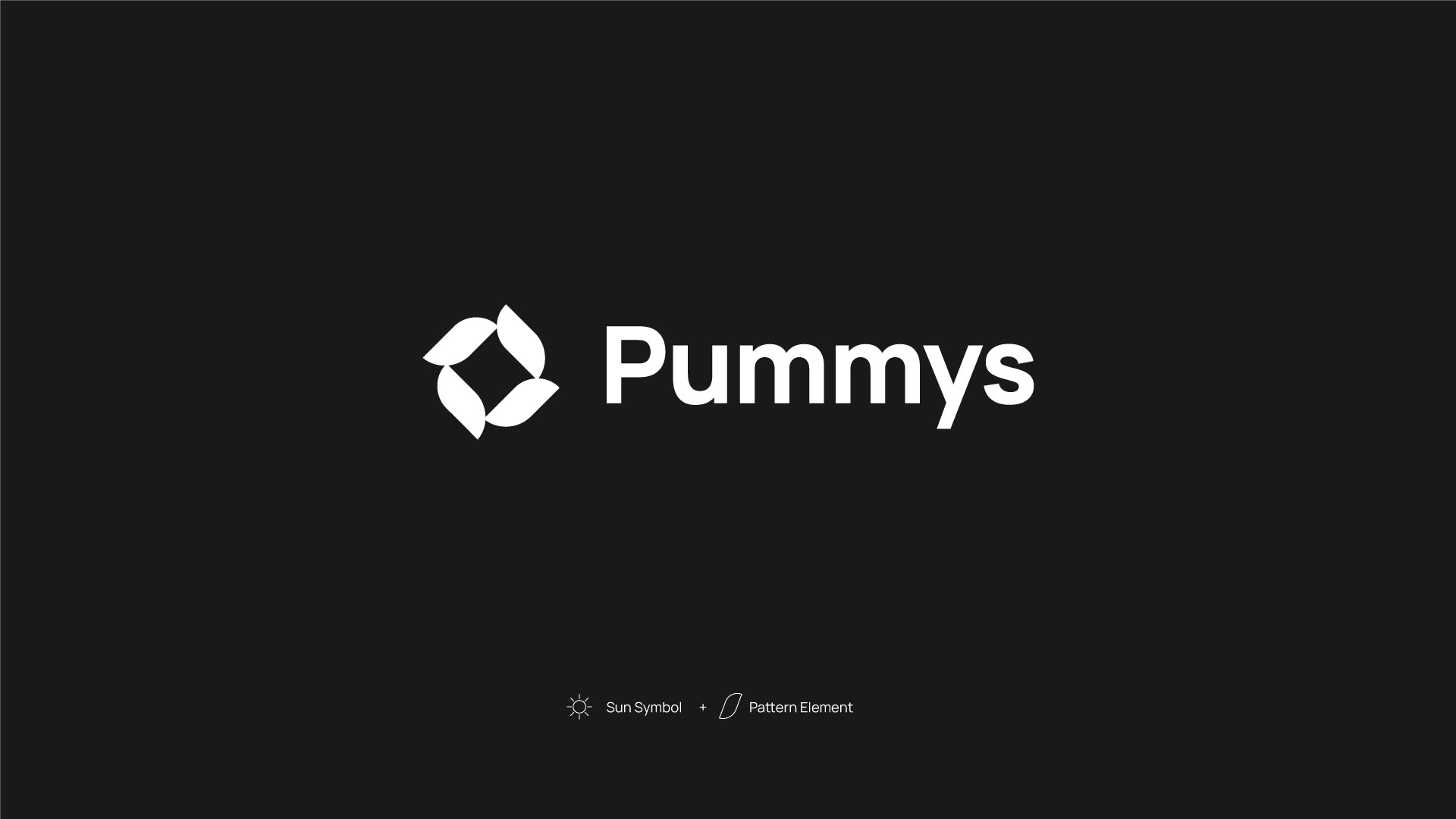
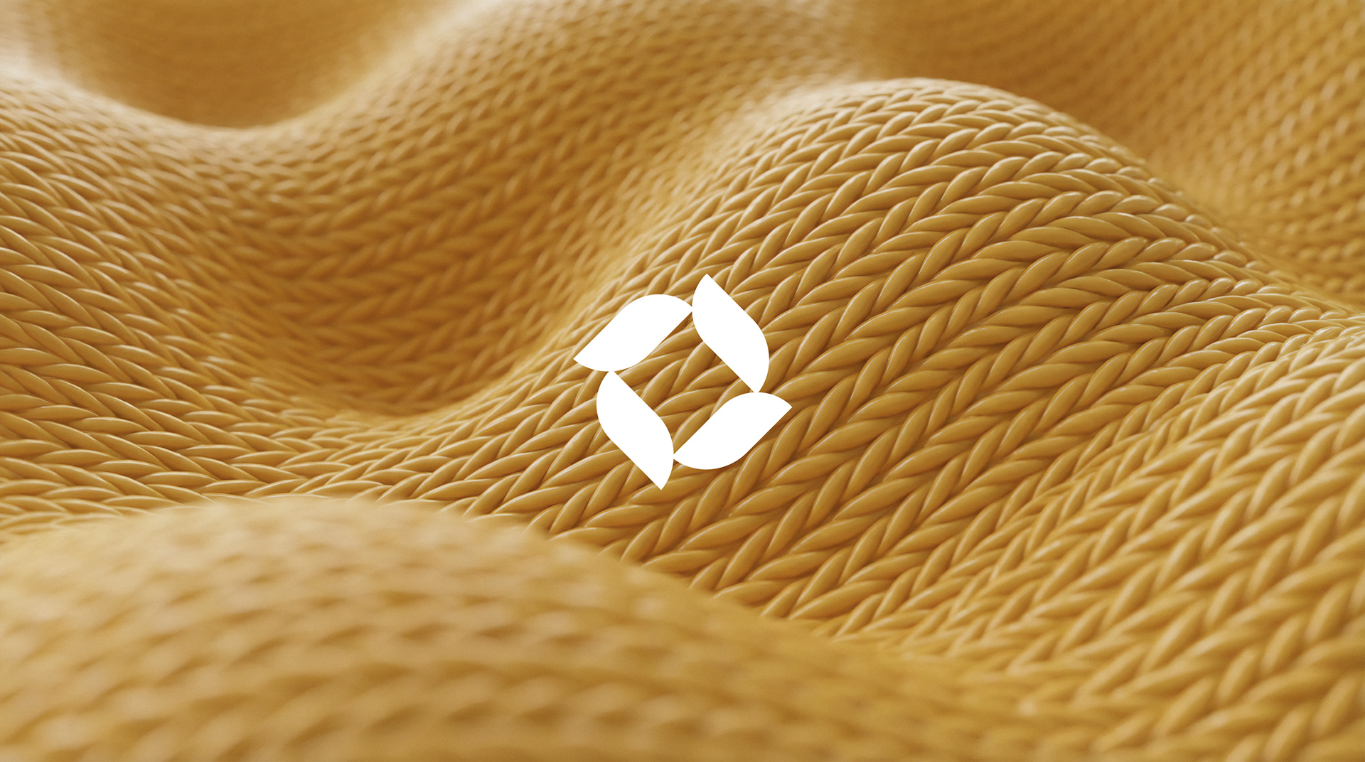
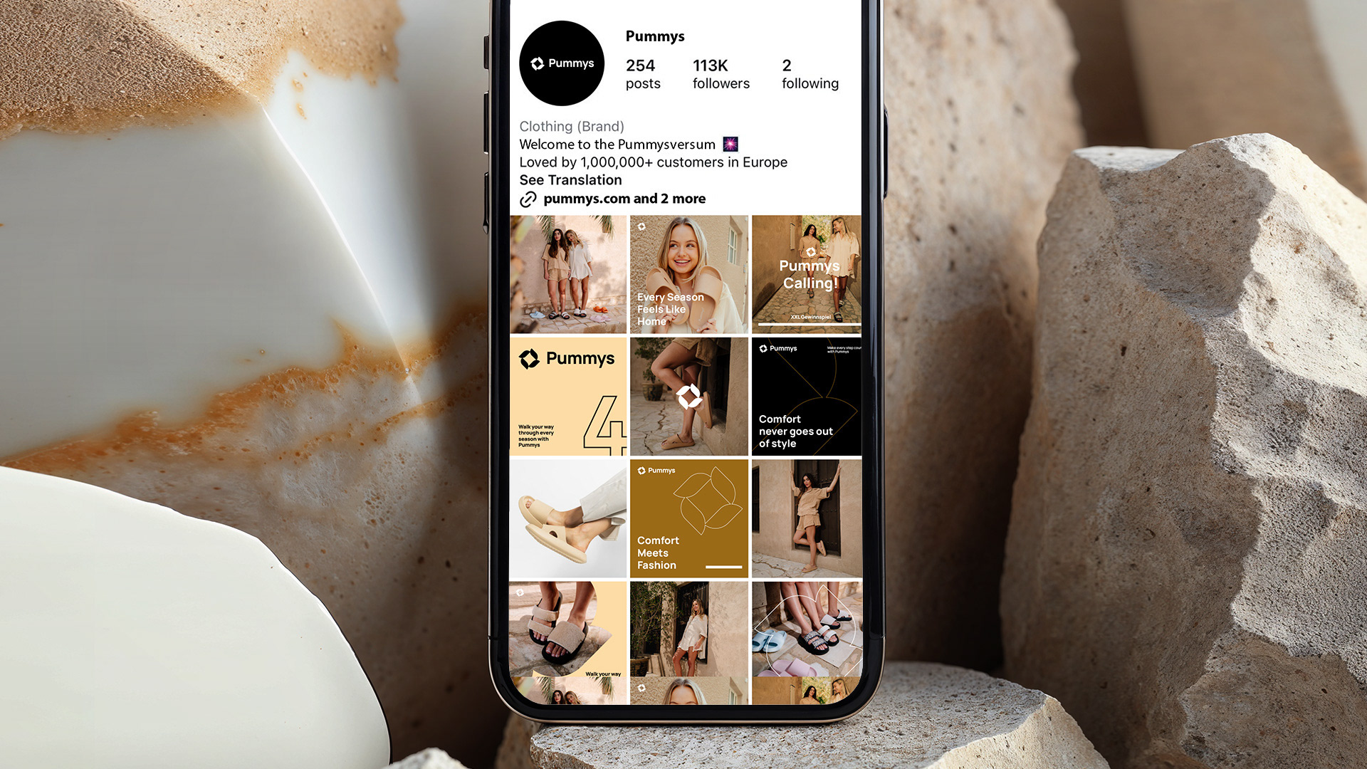
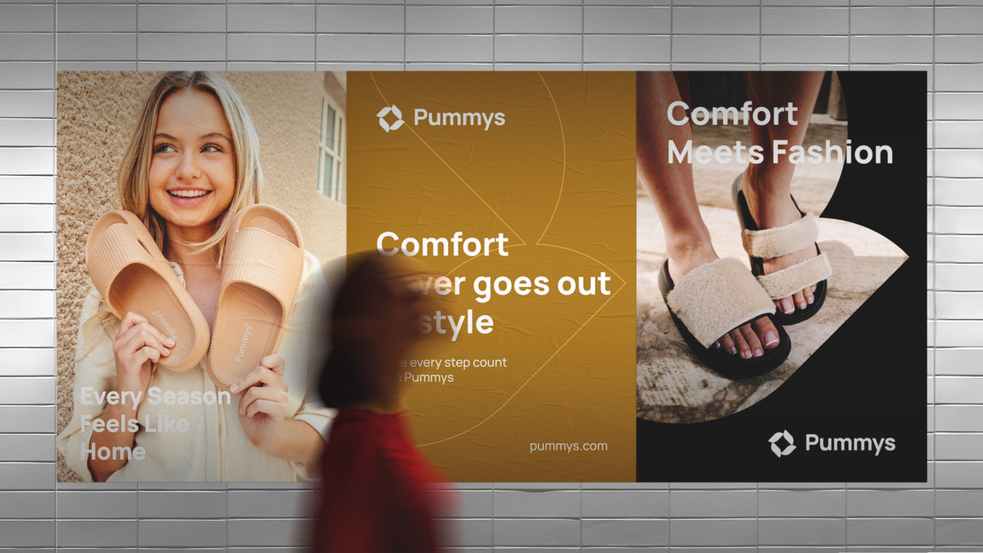
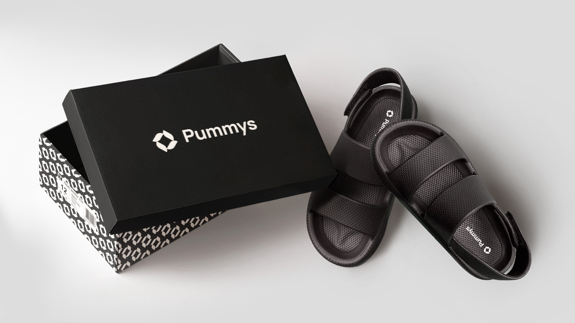
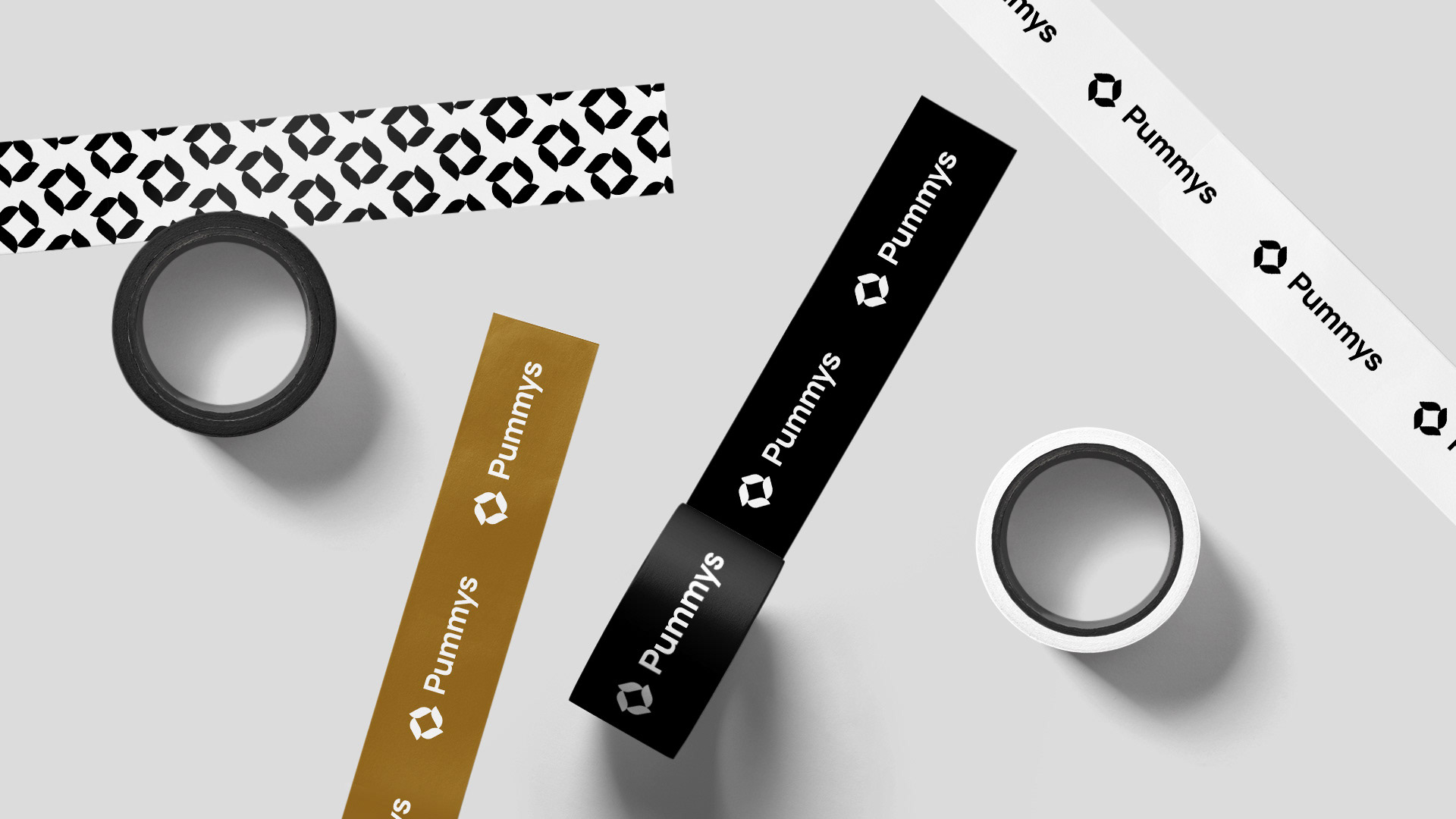
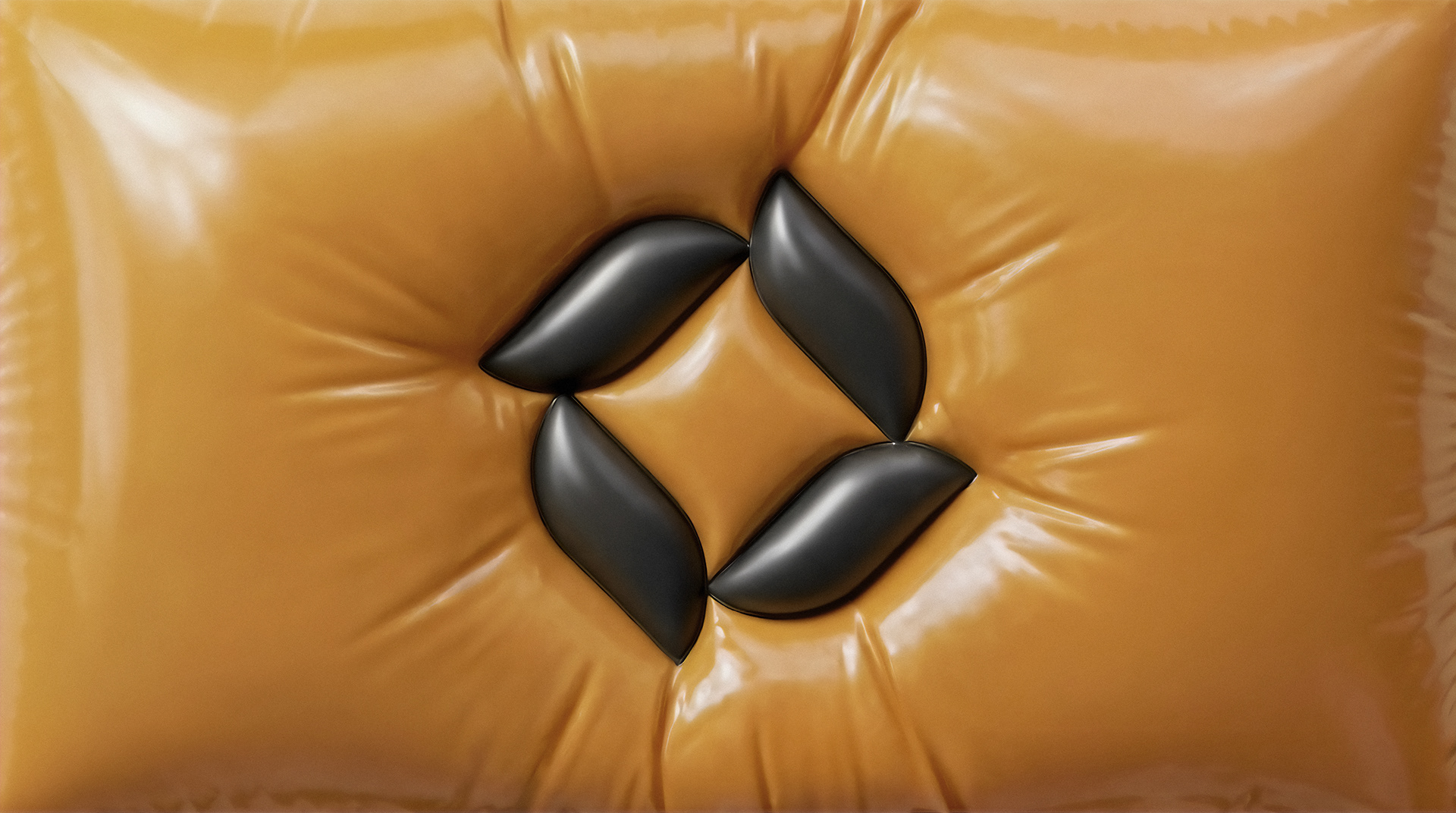
We created a dedicated icon that can function separatley and as brand mark alongside the original logo.
The idea is based on two key elements - the sun and a shape derived from the shoe’s pattern.
The sun symbolizes warmth, comfort, a positive everyday experience, while the abstracted pattern element creates a direct visual connection to the product itself.
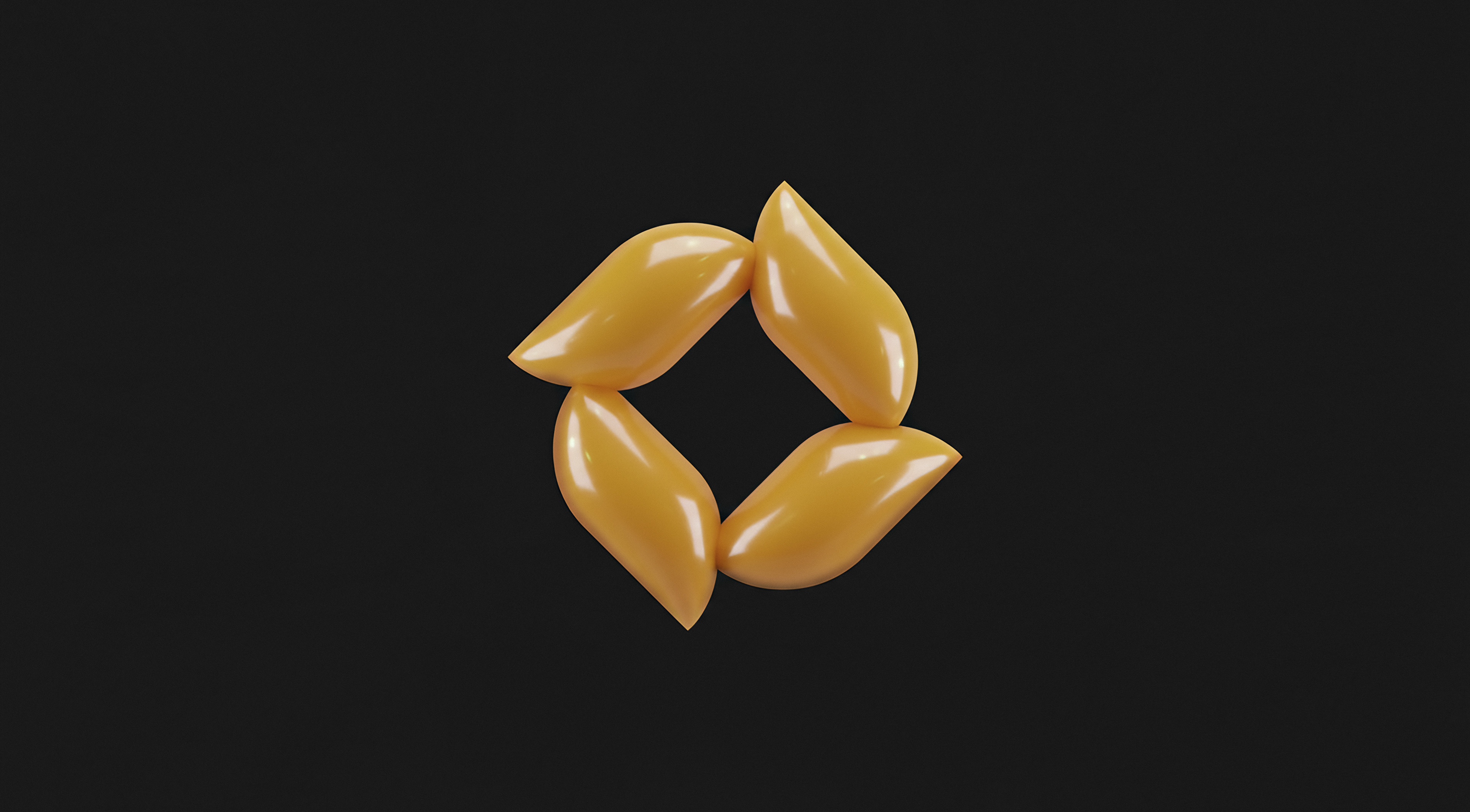
The icon is soft, balanced, calm in its overall appearance. Smooth forms and geometry improve
the qualities that define Pummys footwear. The sense of spin and circular movement within the mark reflect flexibility and natural motion when walking.
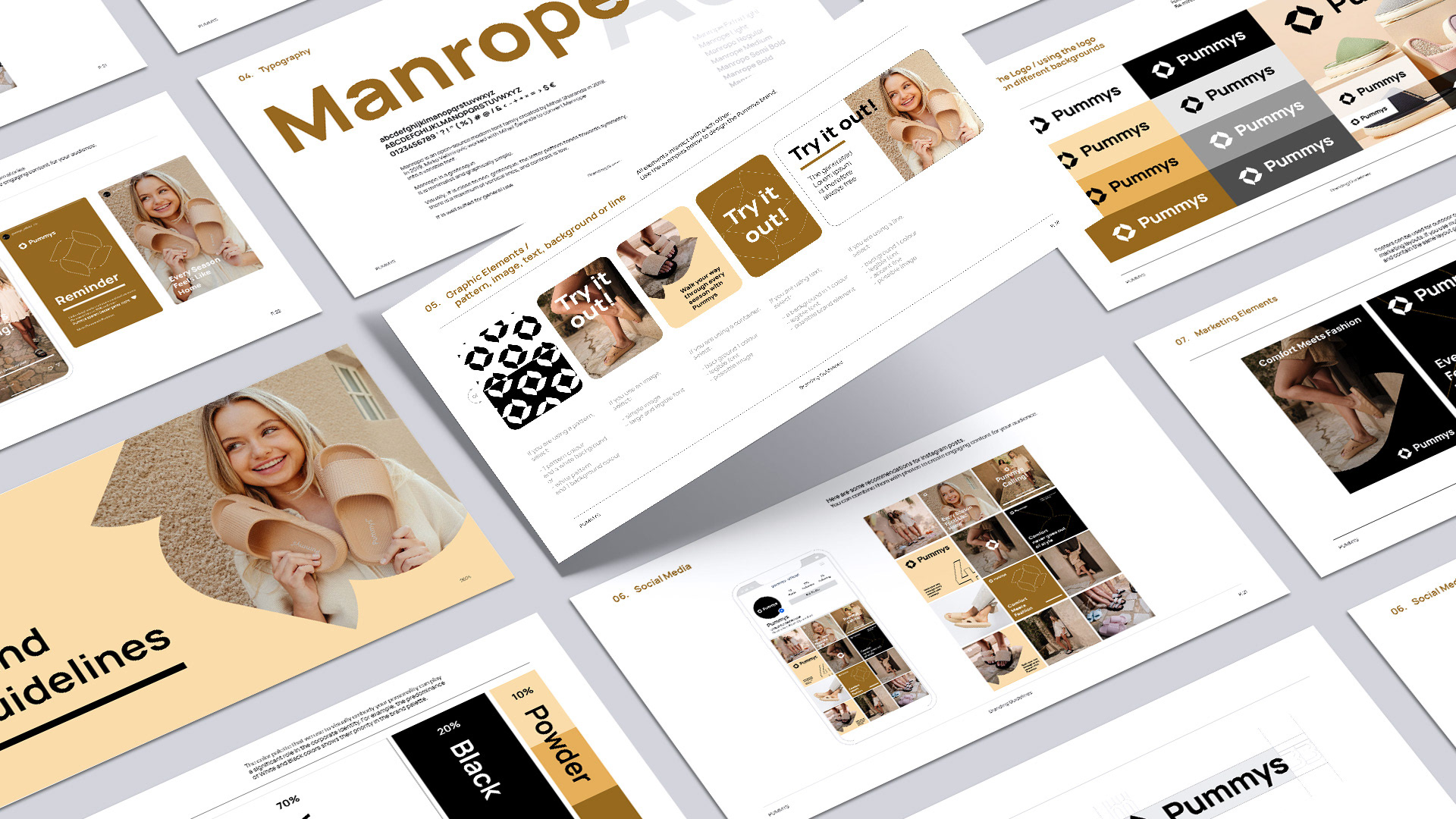
The result is a harmonious icon that improve the existing typographic logo and clearly communicating
the core values of Pummys.